Responsive Web Design Development

Co-Founder

Responsive web design development is the process of building websites that automatically adjust layout, typography, and images based on device screen size using CSS media queries, flexible grids, and fluid typography.
Web design eliminates separate mobile and desktop codebases, reducing development costs while delivering cross-device functionality through a mobile-first architecture that prioritises performance metrics influencing search rankings. Responsive design is essential for visibility, user retention, and conversion optimisation with 71% of web traffic from mobile devices, according to Statcounter Global Stats.
What is Responsive Web Design?
Responsive web design is a way to build websites that automatically change their size and shape depending on what device is used to view them. Developers build one website that works well on all devices, instead of making different websites for phones, tablets, and computers. It saves time and money because only one version needs to be created and maintained.
Web design is important because most users use their phones to browse the internet, and search engines (Google) give higher rankings to websites that work properly on all screen sizes. Visitors stay longer and buy something or fill out a form when a website adapts to different devices.
What Are the Best Frameworks for Responsive Web Development?
The best frameworks for responsive developmentareBootstrap,Tailwind CSS,Foundation by Zurb,Bulma, andUIkit. Each of these frameworks improves layout flexibility, speeds up development, and supports cross-device compatibility.
These frameworks for web development are designed to help you build mobile-friendly websites faster and with fewer layout issues. These frameworks include built-in grid systems, media queries, and UI components optimised for all screen sizes.
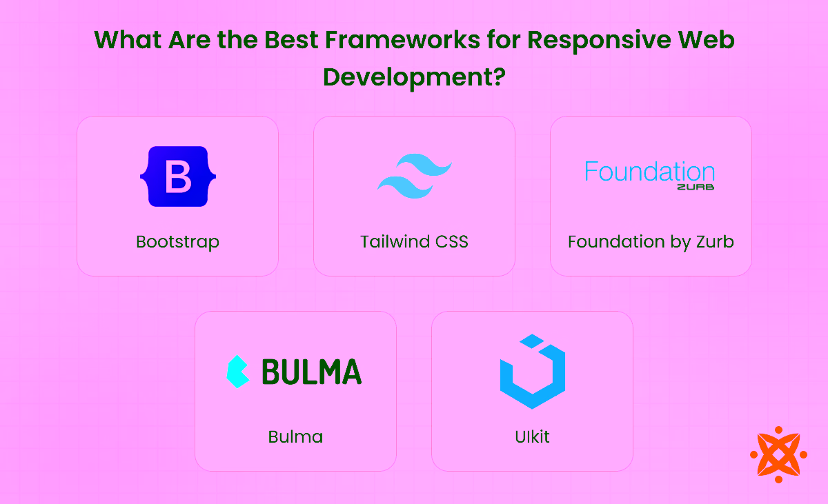
Below are the best frameworks for responsive web development:
- Bootstrap:Bootstrap was released by Twitter in 2011. It supports responsive layout using a 12-column grid, pre-built components, and utility classes. It works withHTML5,CSS3, andJavaScript. You use it through a CDN or npm, with tools likeSass,Gulp, andBootstrap Icons.
- Tailwind CSS:Tailwind CSS came out in 2017 as a utility-first framework for building interfaces fast. It works withHTML,PostCSS, andJavaScript. You apply styles using mobile-first utility classes. Tools likeTailwind CLI,PurgeCSS, and the Just-in-Time compiler improve speed and performance.
- Foundation by Zurb:Foundation by Zurb was launched in 2011 for building advanced responsive layouts. It supportsHTML5,CSS3,JavaScript, andSass. Developers useFoundation CLI,Motion UI, andGulpto handle layout logic, transitions, and accessibility features.
- Bulma:Bulma is a CSS-only framework released in 2016. It's built on Flexbox and supportsHTML5,Sass, and optionalJavaScripttools. It uses semantic class names for layout and spacing. You can set it up via CDN, npm, or bundlers likeParcelandWebpack.
- UIkit:Ulkit was created by YOOtheme for modular and responsive interfaces. It works withHTML,CSS3, andJavaScript. You install it through CDN or npm. Tools likeSCSS mixins,UIkit Icons, andWebpacksupport fast and clean development.
What Programming Languages Are Used for Responsive Web Development?
The main programming languages used for responsive web developmentinclude HTML5, CSS3, JavaScript, Sass, and TypeScript.These languages give you control over content structure, design layout, browser behaviour, and scalability.
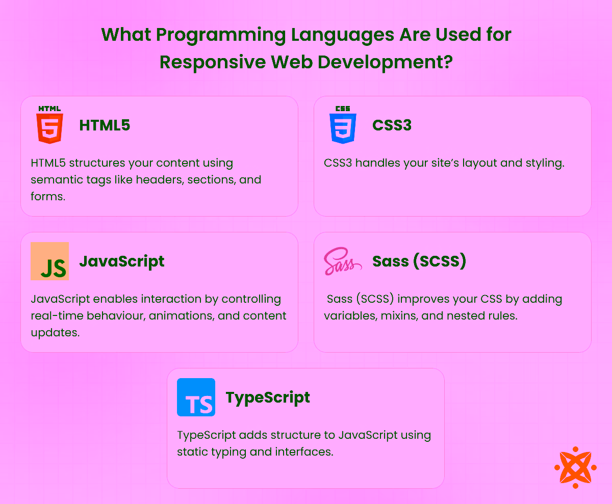
You useHTML5to define page structure,CSS3to apply layout styles and media queries, andJavaScriptto manage dynamic interactions.Sasshelps organise CSS with variables and nesting, whileTypeScriptadds structure and safety to JavaScript codebases.
According to research by the University of Oxford, Department of Computer Science (2022), over 92% of mobile-responsive websites in the UK use this core language set to deliver consistent cross-device performance.
- HTML5:HTML5 structures your content using semantic tags like headers, sections, and forms. It supports multimedia and improves browser rendering. It is fast and widely supported, but needs CSS or JavaScript for visual design and interactivity.
- CSS3:CSS3 handles your site's layout and styling. It offers features likemedia queries,flexbox, andgrid layout. It gives you full control over spacing and appearance. The downside is inconsistent rendering on older browsers.
- JavaScript:JavaScript enables interaction by controlling real-time behaviour, animations, and content updates. It works with the DOM and APIs to build dynamic features. It offers flexibility but increases the risk of security flaws if poorly handled.
- Sass (SCSS):Sass (SCSS) improves your CSS by adding variables, mixins, and nested rules. It helps organise large stylesheets and simplifies code reuse. Sass improves maintainability but needs a compiler and setup tools.
- TypeScript:TypeScript adds structure to JavaScript using static typing and interfaces. It helps catch errors early and makes large codebases easier to manage. It improves code quality but adds complexity to project setup.
How to Make a Responsive Website?
To make Responsive websites automatically adjust tostart with a mobile-first approach, add the viewport meta tag, flexible elements, improve performance and media queries.You maintain readability, navigation, and performance across phones, tablets, and desktops.
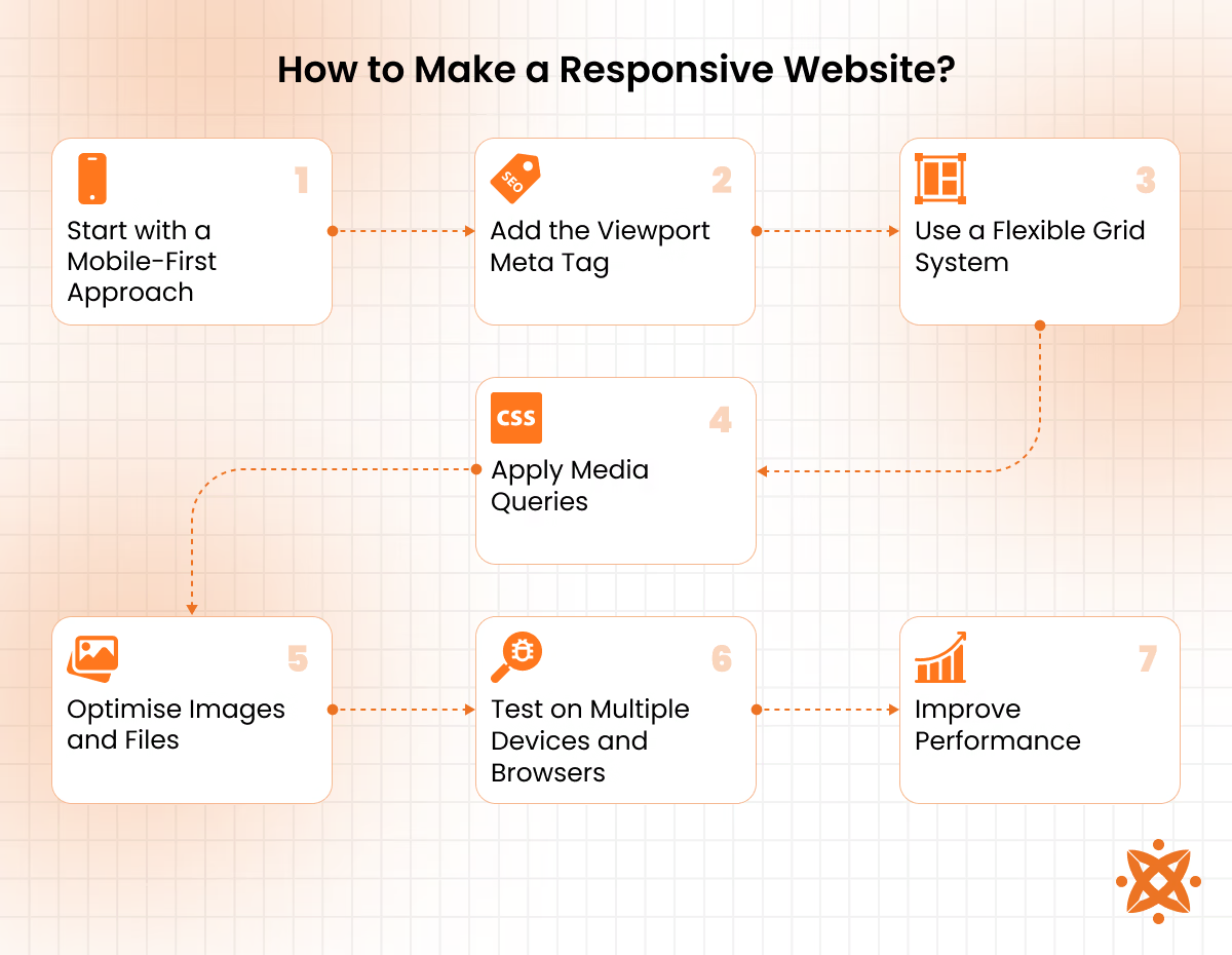
To make a responsive website, follow these core steps:
1: Start with a Mobile-First Approach
You begin by designing for the smallest screen size. This helps you focus on essential content first. It ensures the layout works under tight constraints before scaling up. This also improves performance on mobile networks and avoids clutter on small screens.
2: Add the Viewport Meta Tag
You insert the viewport tag in the HTML <head> section. It tells browsers to scale the layout based on device width. This avoids zoomed-out displays or broken formatting on mobiles. Without it, responsive layouts won't behave correctly on smartphones and tablets.
3: Use a Flexible Grid System
You build layouts with percentage-based columns usingFlexboxorCSS Grid. These systems adjust automatically as screen sizes change. This gives your layout fluidity without fixed widths. You avoid overlapping elements and broken structure across resolutions.
4: Apply Media Queries
You use @media rules to change styles at different screen widths. This helps control spacing, element visibility, and font size. Each breakpoint ensures a clean, readable interface. It lets you fine-tune your layout to suit every device range.
5: Optimise Images and Files
You use responsive image formats like WebP or SVG. Compression tools reduce file size without losing quality. Faster loading boosts both UX and SEO performance. Large media files are a major cause of slow sites and higher bounce rates.
6: Test on Multiple Devices and Browsers
You simulate screen sizes using emulators or test on real devices. This reveals layout errors and interactive bugs. Fixing them ensures a consistent experience for all users. It also helps identify browser-specific issues early in development.
7: Improve Performance
You minify CSS and JavaScript, reduce server requests, and clean unused code. Lazy loading and caching minimize load time. A faster site improves engagement and conversion rates. Google rewards high-performance pages with better rankings.
How does Mobile Responsiveness Affect Website Performance?
Mobile responsiveness affects website performance through faster load times, reduced file sizes, and optimised touch usability in devices. Responsive sites load 2-3 seconds faster than fixed-width designs, with mobile file sizes reduced by 30-50%. Users abandon pages exceeding load delays, directly impacting bounce rates and conversions. Responsive Web Design (RWD) improves usability through properly sized tap targets, eliminates horizontal scrolling, and removes zoom requirements.
Key performance factors include adaptive image serving, CSS breakpoint optimisation, lazy-loading, and render-path prioritisation. Responsive design improves Cumulative Layout Shift, First Contentful Paint, and Largest Contentful Paint metrics below 2.5 seconds, standards Google uses for search ranking, making responsive frameworks essential where mobile app development and web presence strategies intersect.
What are the Benefits of a Mobile Responsive Website?
The benefits of a mobile-responsive website are listed below.
- Faster Loading Speed: Mobile-responsive design reduces file sizes by 30-50%, enabling pages to load 2-3 seconds quicker on smartphone connections.
- Improved User Experience: Adaptive layouts eliminate horizontal scrolling, provide touch-friendly navigation, and deliver readable text without zoom requirements on all devices.
- Lower Bounce Rate: Fast-loading responsive sites retain 40% more users compared to fixed-width designs that exceed 3-second load times.
- Higher Search Ranking: Google prioritises responsive websites in mobile search results, using Cumulative Layout Shift and Largest Contentful Paint metrics for ranking algorithms.
- Increased Conversion Rate: Users complete purchases and form submissions more readily on responsive sites due to mobile checkout flows and reduced friction.
- Single Codebase Maintenance: Developers manage one responsive template rather than separate mobile and desktop versions, reducing development costs by 25-40%.
- Future Device Compatibility: Flexible grids and media queries automatically adapt to new screen sizes without requiring redesign or code updates.
- Accessibility Compliance: Semantic HTML, proper heading hierarchy, and keyboard navigation in responsive templates meet WCAG standards for disabled users.
How to make a website mobile-friendly?
To make a website mobile-friendly, follow the six steps listed below.
- Implement Flexible Grids. Use percentage-based widths instead of fixed pixels to enable layout fluidity in screen sizes, forming the foundation of mobile responsive design.
- Optimise Images. Serve multiple image sizes using srcset and picture elements, reducing file downloads on mobile devices without sacrificing visual quality.
- Set Viewport Meta Tags. Add viewport declarations in HTML head sections to instruct browsers to scale content appropriately, preventing horizontal scrolling on smartphones.
- Apply CSS Media Queries. Use breakpoints at 320px (mobile), 768px (tablet), and 1024px+ (desktop) to trigger layout adjustments based on screen dimensions and device capabilities.
- Test Device Compatibility. Validate mobile responsive website functionality in iOS Safari, Chrome Android, and Samsung Internet using real devices or browser emulator tools to confirm usability.
- Reduce Load Time. Implement lazy-loading for images, minify CSS and JavaScript, and enable GZIP compression to achieve page loads under 2.5 seconds on 4G mobile networks.
Why Should Businesses Invest in Custom Responsive Web Design?
Businesses should invest in custom responsive web design because solutions provide competitive differentiation, eliminate template constraints, and align interfaces with brand identity. Custom designs support business scalability through direct CRM and analytics integration rather than adapter-dependent third-party tools, delivering ROI within 6-12 months through customer engagement.
Branding advantages include proprietary colour systems and interaction patterns that competitors using templates do not replicate. Custom architecture enables user behaviour tracking, conversion optimisation through design changes, and expansion without vendor lock-in, where web design investment recovers costs through 15-25% increases in Customer Lifetime Value (CLV) and market share gains unavailable through template alternatives.
How does Custom Responsive Web Design Improve User Experience?
Custom responsive web design improves user experience through breakpoint-based layouts that adjust CSS grid structures and navigation menus rather than forcing single designs that break on different screens.
Custom designs implement touch-optimised interfaces, lazy-loaded content, and viewport-adapted typography that eliminate pinch-zoom requirements, allowing users to navigate without interaction friction. Gesture-enabled interfaces and device-specific interactions enable users to switch between mobile, tablet, and desktop without relearning menu structures or navigation flows.
Is Hiring Web Development Services Worth It for Responsive Business Websites?
Yes, hiring a web development service is worth it for responsive business websites because developers reduce development timelines, implement custom layouts meeting brand standards, and maintain code quality, avoiding expensive redesigns. Outsourced teams handle ongoing maintenance and security updates that internal staff do not sustain. Investment in web development services eliminates internal hiring costs and enables businesses to scale without diverting resources from revenue-generating activities.
How do Developers Create Responsive Website Layouts?
Developers create responsive website layouts through CSS Grid and Flexbox container models with media queries at predefined breakpoints, using mobile-first methodology to establish base styles for smaller viewports and improve for larger screens. Viewport units (rem, em, vw, vh) and fluid typography scale in devices without hardcoded sizes, while CSS preprocessors (Syntactically Awesome Style Sheets) automate variable management.
Responsive images use srcset and picture elements to serve optimised file sizes. Container queries enable components to adapt based on the viewport size. The responsive web developers implement JavaScript frameworks for dynamic layout recalculation on resize events and modern CSS features (aspect-ratio) properties to maintain proportional dimensions, enabling web developer teams to preserve spacing, typography hierarchies, and touch interaction targets without duplicating code in breakpoints.
What Role Does HTML Play in Responsive Web Design?
HTML controls viewport configuration and structure in responsive web design through meta viewport tags that instruct browsers on scaling, and srcset/picture elements that enable device-specific image delivery without CSS intervention.
The viewport meta tag scales content appropriately to screen dimensions, while srcset attributes and picture elements allow HTML website design to serve optimised image sizes matching device capabilities. Responsive HTML establishes accessibility through proper heading hierarchy and ARIA attributes, where semantic HTML meaning ensures assistive technologies interpret document structure regardless of screen size or browser capability.
How does CSS contribute to Responsive Website Design?
CSS Contribute to Responsive Website Design through media queries, Flexbox, and CSS Grid, enabling layouts to adapt dynamically across viewports without requiring HTML modifications or JavaScript dependencies. Responsive CSS variables automate spacing and colour values across breakpoints, reducing code duplication. Container queries allow components to adapt based on the parent container width rather than a fixed viewport size.
Responsive web design CSS implements object-fit, and picture element styling to maintain proportional image dimensions in devices without distortion. Modern CSS meaning in responsive design encompasses Flexbox gap properties, CSS Grid auto-fit columns, and clamp() functions that scale typography between defined minimum and maximum sizes, ensuring visual hierarchy regardless of screen dimensions.
Why are Responsive Images Important for Website Performance?
Responsive images are important for website performance because device-specific image delivery reduces file sizes by 30-50%, lowering bandwidth consumption and enabling faster downloads on mobile networks. Srcset attributes and picture elements serve optimised resolutions matching device pixel ratios, while WebP format reduces file sizes by 25-35% compared to JPEG/PNG without sacrificing quality.
Lazy-loading defers off-screen image loading, and aspect-ratio declarations prevent Cumulative Layout Shift, improving stability and user experience. Image optimisation impacts Core Web Vitals metrics that influence search ranking, making responsive images essential for performant websites.
Why is Responsive UI Important for Web Applications?
Responsive UI is important for web applications because user interactions must function in touchscreens, trackpads, and mouse inputs while maintaining application state consistency in Android and iOS. Responsive web app development prioritises performance on low-end devices by implementing improvements and efficient state management that retains user engagement in mobile, tablet, and desktop environments.
Applications with responsive interfaces experience higher user retention compared to device-locked alternatives, making responsive design essential for conversion metrics.
What is the difference between Responsive UI and Adaptive UI?
Responsive UI adjusts layout in all screen sizes using CSS media queries and flexible grids, while Adaptive UI detects specific devices and serves predetermined fixed layouts for exact dimensions.
Responsive UI dominates web development because adaptation accommodates device variations better than Adaptive's device-specific detection, making user interface flexibility the deciding factor where responsive outperforms for applications.
Never Miss an Update From Us!
Sign up now and get notified when we publish a new article!


 India
India
514, Silver Radiance 2, Science City Rd, Nr. Shakti Arcade, Sola, Ahmedabad, Gujarat