Mobile Web Development: Definition, Frameworks, Programming Languages, Process

Co-Founder

Mobile Web Development focuses on building websites that adapt smoothly to smartphones and tablets using responsive design, optimised layouts, and touch interfaces. It improves user experience (UX) across all mobile browsers.
The best frameworks and tools for Mobile Web Development include front-end frameworks like React Native, Flutter, Ionic, and Xamarin, which enable cross-platform development. They enhance web performance and support responsive, mobile-first design.
Programming languages used for mobile web projects include HTML5, CSS3, and JavaScript, which define layout, style, and interactivity. TypeScript, Python, PHP, and Java extend support for structured logic, data processing, and scalable back-end systems.
To create a mobile-friendly website, use CSS3 media queries, compress assets, and design for touch-based navigation. Test compatibility across screen sizes and WebView environments, and apply mobile SEO techniques like structured data and performance audits.
According to data published by StatCounter in the report titled "Global Web Traffic Share by Device," 2024, mobile devices now account for over 58.67% of all global web traffic, underscoring the need for businesses to prioritise mobile-first development in their digital strategy.
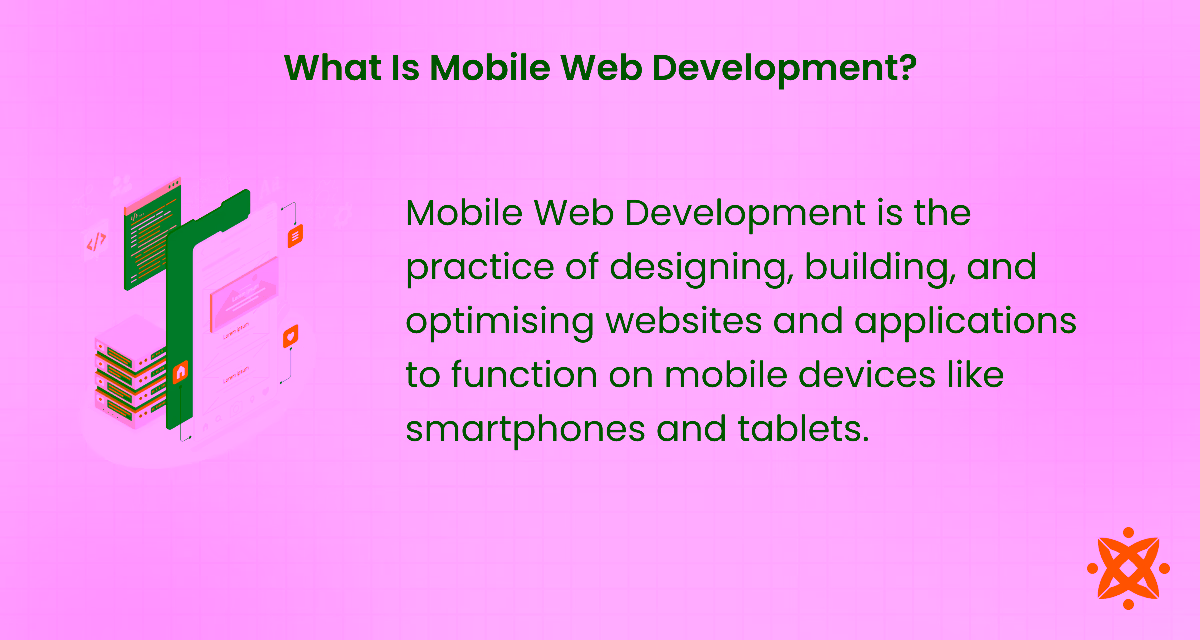
What Is Mobile Web Development?
Mobile Web Development is the practice of designing, building, and optimising websites and applications to function on mobile devices like smartphones and tablets. It involves a range of techniques, including responsive design, touch interface optimisation, and mobile-specific features to ensure a smooth user experience.
The rise of mobile usage is driven by the growing adoption of smartphones, which are now integral to daily life for browsing, shopping, and accessing services. This shift has led to a surge in demand for websites and applications that offer a fast, intuitive, and mobile-optimised experience. As mobile-first browsing continues to dominate, businesses must focus on mobile web development to stay competitive and reach their target audience effectively.
In a digital strategy, mobile web development plays a crucial role in driving engagement and conversions by ensuring that websites and applications are accessible and functional across all devices. A mobile-optimised site enhances user experience, improves SEO, and fosters higher customer retention, making it a key component of any successful digital approach.
What Are The Best Frameworks And Tools For Mobile Web Development?
The best frameworks and tools for mobile web development are front-end frameworks, back-end frameworks, and Progressive Web App (PWA) tools. These tools enable offline access, bringing native app-like experiences to mobile websites.
Below are the best frameworks and tools for mobile web development:
Frontend Mobile Web Development Frameworks
The best front-end mobile web development frameworks are React native, Flutter, Ionic, Xamarin, and Apache Cordova. These help developers build responsive, interactive, and cross-platform applications with minimal effort and maximum performance.
Below are the key frontend mobile web development frameworks:
- React Native: React Native is a JavaScript-based framework created by Facebook in 2015 for building native mobile applications using React. It supports both Android and iOS platforms with one codebase. It uses JavaScript and JSX and is considered beginner-friendly due to its reusable components. To use it, developers need Node.js, npm, and a code editor like Visual Studio Code.
- Flutter: Google developed Flutter, an open-source UI toolkit for building natively compiled applications across mobile, web, and desktop, in 2017. It uses the Dart programming language and comes with a rich set of prebuilt widgets. Flutter is known for its fast development and expressive UI. Developers need the Flutter SDK and Android Studio or Visual Studio Code to get started.
- Ionic: Ionic, launched in 2013, is a framework built on web standards (HTML, CSS, JavaScript). It allows developers to build mobile apps using familiar web technologies. Ionic integrates with Angular, React, or Vue and is easy to learn for those with front-end experience. Required tools include Node.js, npm, and the Ionic CLI.
- Xamarin: Microsoft developed Xamarin, a cross-platform mobile app framework, in 2011. It allows developers to write applications in C# using the .NET platform. Xamarin compiles to native code and provides access to native APIs. It requires Visual Studio and is ideal for developers with C# experience.
- Apache Cordova: Apache Cordova, originally developed by Nitobi and later acquired by Adobe, enables developers to wrap HTML, CSS, and JavaScript into a native app shell. It allows web apps to access device features via plugins. Cordova is simple to set up and uses standard web technologies. Tools required include Node.js, npm, and Cordova CLI.
Front-end Mobile Web Development Tools
The best front-end mobile web development tools are Bootstrap, Tailwind CSS, Foundation, Webpack, and PostCSS. These tools are essential for faster styling, improved user experience, and cleaner code.
Below are the front-end mobile web development tools:
- Bootstrap: Bootstrap is a popular front-end toolkit developed by Twitter in 2011. It uses HTML, CSS, and JavaScript to create responsive layouts with a grid system and prebuilt UI components. It is easy to use, especially for beginners, and requires only basic front-end knowledge to get started.
- Tailwind CSS: Tailwind CSS is a utility-first CSS framework introduced in 2017. It allows developers to style elements directly in HTML using pre-defined utility classes. Tailwind is flexible, fast to implement, and reduces the need to write custom CSS. It works with most modern build tools like PostCSS or Webpack.
- Foundation: Foundation, developed by Zurb, is a responsive front-end framework launched in 2011. It includes a mobile-first grid system and reusable UI components. Foundation is more advanced than Bootstrap and offers greater flexibility, though it requires more configuration upfront
- Webpack: Webpack is a module bundler for JavaScript applications that compiles CSS, images, and other assets into efficient bundles. It was introduced in 2012 and is widely used for optimising performance in large applications. While setup can be technical, it becomes straightforward with community presets and documentation.
- PostCSS: PostCSS is a tool for transforming CSS with JavaScript plugins. Launched in 2013, it enables developers to use modern CSS features and automate tasks like prefixing. It integrates well with build systems like Webpack and is easy to use for developers familiar with CSS workflows.
Back-end and API Mobile Web Development Tools
The best back-end and API tools for mobile web development are Next.js with Node.js, Node.js, Express.js, Firebase, and GraphQL. These tools create scalable, secure, and responsive mobile experiences.
The best back-end and API mobile web development tools are explained below:
- Next.js with Node.js/Express or APIs: Next.js is a React-based framework created by Vercel in 2016 that supports server-side rendering and static site generation. When combined with Node.js and Express, it offers a full-stack environment where developers build both front-end interfaces and back-end APIs. It is easy to use for developers familiar with JavaScript and React, and setup is supported through npm and Vercel CLI.
- Node.js: Node.js is a JavaScript runtime built on Chrome's V8 engine, released in 2009. It allows developers to write server-side code using JavaScript, making it easier to use the same language across the stack. Node.js is lightweight, fast, and scalable, and works well with npm for managing libraries.
- Express.js: Express.js is a minimal and flexible web application framework for Node.js, introduced in 2010. It simplifies tasks like routing, middleware, and API development. Express is widely used and beginner-friendly, requiring only Node.js and npm to set up.
- Firebase: Firebase is a Backend-as-a-Service (BaaS) platform from Google that provides real-time databases, authentication, and hosting. It abstracts most server-side complexities, allowing developers to build fully functional apps quickly. Firebase is simple to use and integrates well with mobile frameworks like Flutter and React Native.
- GraphQL: GraphQL is an open-source query language for APIs developed by Facebook in 2015. It lets clients request exactly the data they need, reducing over-fetching. It is efficient and works well with mobile apps that require custom, dynamic content. It runs on Node.js and is easy to integrate using tools like Apollo Server.
Progressive Web App (PWA) Tools
The best tools for developing Progressive Web Apps are Workbox, Lighthouse, PWA builder, Vue CLI PWA plugin and Angular service Worker. It helps implement features like offline support, push notifications, and fast loading. These tools make it easier to build web applications that deliver app-like experiences on mobile devices.
The best progressive web app tools for mobile web development are:
- Workbox: Workbox is a set of JavaScript libraries developed by Google to simplify the creation of service workers and caching strategies for PWAs. Launched in 2017, it automates tasks like pre-caching and runtime caching. It's easy to use with build tools like Webpack or command-line integration, and it's well documented.
- Lighthouse: Lighthouse is an open-source performance auditing tool developed by Google. It analyses PWA readiness by measuring metrics like load speed, accessibility, and SEO. Built into Chrome DevTools, it is easy to run and interpret, making it beginner-friendly for developers aiming to improve web performance.
- PWA Builder: PWA Builder is a Microsoft tool launched to help developers turn regular websites into Progressive Web Apps quickly. It scans a site and generates the necessary service worker code and manifest files. The tool is user-friendly and ideal for developers with limited PWA experience.
- Vue CLI PWA Plugin: This plugin is part of the Vue CLI ecosystem and adds PWA functionality to Vue.js apps. Maintained by the Vue.js team, it supports features like caching and offline access. It integrates easily into Vue projects and works with minimal configuration, making it suitable for developers already using Vue.
- Angular Service Worker: The Angular Service Worker is part of the Angular framework and enables PWA capabilities in Angular applications. Introduced as part of Angular's official libraries, it supports automatic caching, offline support, and update management. It is built-in and easy to configure using Angular CLI.
What Programming Languages Are Used For Mobile Web Development?
The main programming languages used for mobile web development are front-end languages and back-end languages. They support interactive features, responsive layouts, and efficient server communication.
Below are the main programming languages used for mobile web development:
Frontend Mobile Web Development Programming Languages
The programming languages used for front-end mobile web development include HTML, CSS, JavaScript, TypeScript, Dart, JSX, and SASS/SCSS. These languages are fundamental for building responsive, interactive, and visually engaging mobile web interfaces. They allow developers to design layouts, add styling, and enable user interaction on mobile browsers. Below is a breakdown of each language.
The programming languages used for front-end mobile web development are:
- HTML: HTML (HyperText Markup Language) structures the content of a web page, defining elements like text, buttons, images, and input fields. It forms the backbone of any website and works hand-in-hand with CSS and JavaScript. While it is easy to learn and universally supported, HTML alone cannot add style or behaviour to a page.
- CSS: CSS (Cascading Style Sheets) styles HTML elements and defines layout, colour schemes, fonts, and responsiveness across different screen sizes. It enables developers to create mobile-friendly designs using techniques like media queries and Flexbox. CSS is powerful for design control, though complex layouts may require more time and expertise.
- JavaScript: JavaScript is a client-side scripting language that adds interactivity and dynamic behaviour to mobile websites. It is used for animations, navigation menus, form handling, and content updates without reloading the page. While JavaScript is essential and widely supported, unoptimised scripts lead to performance issues on mobile devices.
- TypeScript: Microsoft developed TypeScript, a statically typed superset of JavaScript. It improves code quality by enabling type checking and catching errors during development. TypeScript enhances maintainability in large codebases but requires compilation and has a steeper learning curve for beginners.
Backend Mobile Web Development Programming Languages
The programming languages used for backend mobile web development include JavaScript (Node.js), Python, PHP, Ruby, and Java. These languages power the server-side logic of web applications, handling everything from database communication to API responses and user authentication. They are essential in delivering fast, secure, and scalable services for mobile web apps.
The programming languages used for backend mobile web development are:
- JavaScript (Node.js): JavaScript, when used with Node.js, enables developers to build backend systems using the same language as the front end. Node.js is a runtime environment that allows JavaScript to run on the server side. It uses an event-driven, non-blocking I/O model, making it lightweight and efficient. While it simplifies full-stack development and has a large ecosystem, it may not perform as well for CPU-intensive operations.
- Python: Python is a high-level, interpreted language known for its clean syntax and readability. It is widely used in backend web development, especially with frameworks like Django and Flask. Python's extensive libraries make it a popular choice for APIS, machine learning, and automation. However, Python may have slower runtime performance compared to compiled languages like Java.
- PHP: PHP is a server-side scripting language embedded in HTML, widely used for building dynamic websites and content management systems. It integrates easily with MySQL databases and is supported by nearly all hosting providers. PHP is simple to learn and quick to deploy, but it has a dated syntax and is less common in modern high-performance applications.
- Ruby: Ruby is a dynamic, object-oriented programming language best known for the Ruby on Rails framework. It follows the “convention over configuration” principle, allowing developers to build applications quickly with minimal setup. Ruby is valued for developer productivity and elegant syntax, but its performance and scalability have declined in popularity in recent years.
- Java: Java is a statically typed, object-oriented language widely used in enterprise-level backend systems and Android development. It is known for its reliability, strong typing, and portability across platforms. Java offers excellent performance and scalability, but its verbose syntax makes development slower and more complex compared to newer languages.
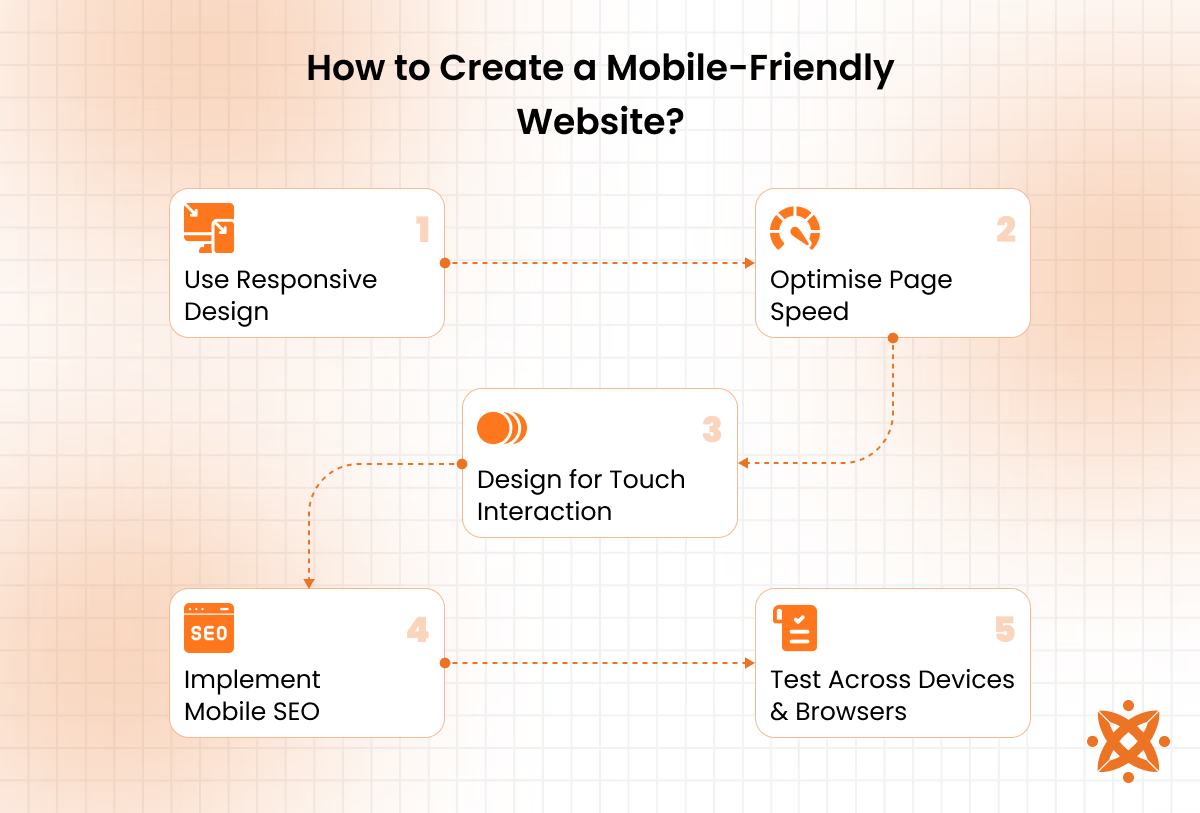
How to Create a Mobile-Friendly Website?
To create a mobile-friendly website, you must use responsive design, optimise page speed, design for touch interaction, implement mobile SEO and test across devices and browsers. Following this set of design and development practices ensures your site functions properly on smartphones and tablets
Below is how to create a mobile-friendly website:
Step 1: Use Responsive Design
Apply responsive design principles by using flexible grid systems, fluid layouts, and CSS3 media queries to ensure your website automatically adapts to any screen size. This approach provides a consistent user experience across smartphones, tablets, and desktops without requiring separate versions of the site.
Step 2: Optimise Page Speed
Compress all images, minify your HTML, CSS, and JavaScript files, and remove unnecessary assets to reduce load times. Faster pages lead to better engagement, improved mobile search rankings, and lower bounce rates—especially important for users on slower mobile networks.
Step 3: Design for Touch Interaction
Avoid relying on hover-only navigation and ensure interactive elements like buttons and links are large, spaced out, and easy to tap with a finger. Touch-friendly design reduces frustration, improves accessibility, and makes your site more usable on all mobile devices.
Step 4: Implement Mobile SEO
Use mobile-optimised meta tags, apply structured data for better indexing, and maintain a logical, crawlable site structure. Leverage tools like Google Lighthouse and Mobile-Friendly Test to identify and resolve SEO issues that may impact visibility on mobile search results.
Step 5: Test Across Devices and Browsers
Use both emulators and real devices to test your website's performance on different screen sizes, operating systems, and browsers. This process helps you catch inconsistencies in layout, functionality, or loading issues before users experience them.
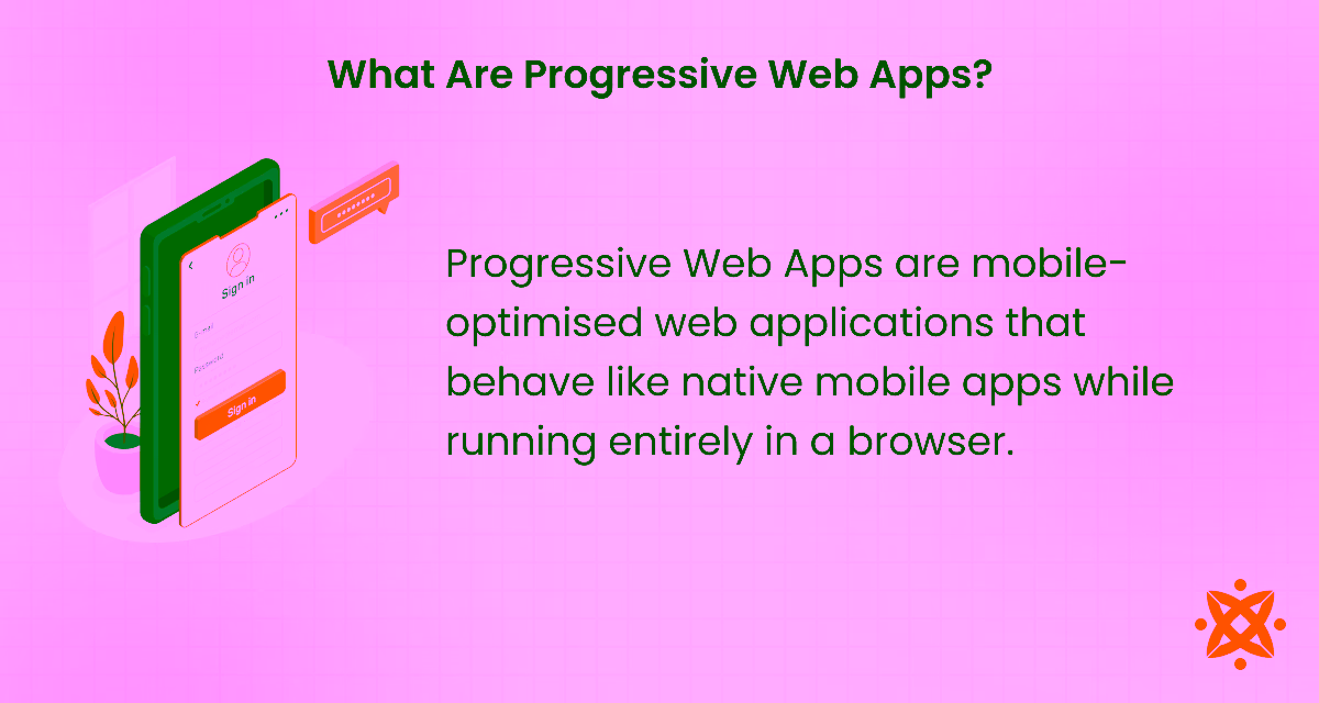
What Are Progressive Web Apps?
Progressive Web Apps are mobile-optimised web applications that behave like native mobile apps while running entirely in a browser. They combine the reach of the web with the smooth, app-like experience users expect on mobile devices. PWAs are built using standard web technologies such as HTML, CSS, and JavaScript, but enhanced with service workers, manifests, and caching strategies.
Key features of PWAs include offline access, fast loading, home screen installation, push notifications, and background updates. They require no downloads from an app store and occupy minimal device storage. PWAS also support responsive design, making them functional across all screen sizes and operating systems.
PWAs enhance the mobile experience by improving load speeds, enabling offline use, and offering native-like interactions, without the friction of app store installation. This improves engagement, reduces bounce rates, and allows businesses to deliver a reliable, high-performing experience on mobile devices even with poor or limited internet access.
What is the Difference Between Mobile Web Development and Mobile App Development?
The main difference between mobile web development and mobile app development is that mobile web development focuses on building websites that are accessible through mobile browsers. In contrast, mobile app development involves creating software applications that must be downloaded and installed on a device.
Mobile websites are built using web technologies like HTML, CSS, and JavaScript and are accessed instantly without installation. In contrast, mobile app development uses platform-specific languages such as Swift for iOS or Kotlin for Android, or with cross-platform frameworks like Flutter or React Native.
What is the Difference Between Mobile Web Development and Native App Development?
The main difference between mobile web development and native app development is that mobile web development delivers content through a mobile browser. In contrast, native app development creates applications specifically built for a particular operating system, like iOS or Android.
Mobile web development uses web technologies such as HTML, CSS, and JavaScript to ensure compatibility across all devices without installation. In contrast, native apps are written in platform-specific languages, Swift or Objective-C for iOS, Kotlin or Java for Android and must be downloaded from app stores.
Updates to web app development deploy immediately across all users, while native app updates require approval and manual installation through respective app stores..
What is the Difference Between Mobile Web Development and Web Development?
The main difference between mobile web development and web development is that mobile web development focuses on creating websites specifically optimised for mobile devices. In contrast, web development refers to building websites for general access across all devices, including desktops, laptops, tablets, and phones.
Mobile web development involves responsive layouts, faster load times, and touch-friendly interfaces to ensure smooth performance on smartphones and tablets. Web development, on the other hand, includes both desktop and mobile optimisation but leans more heavily on features suitable for larger screens and traditional mouse-keyboard interaction.
How to Optimise Mobile Web Performance?
To optimise mobile web performance, Minify code, compress images, use a CDN, leverage browser caching and implement lazy loading and limit HTTP requests. Each step should focus on eliminating unnecessary delays while maintaining design integrity.
Below is how to optimise web performance:
- Minify Code: Remove unnecessary spaces, line breaks, and comments from your HTML, CSS, and JavaScript files. Smaller files load faster and reduce the processing burden on mobile browsers.
- Compress Images: Optimise all images using tools like TinyPNG or Squoosh, and convert them to formats like WebP for faster delivery. Responsive image tags ensure devices only load what they need.
- Use a CDN: Distribute your website's static resources—images, stylesheets, and scripts—through a global Content Delivery Network. This reduces latency by serving content from servers closer to the user's location.
- Leverage Browser Caching: Configure cache-control headers to store static assets locally. This prevents the need to re-download files on repeat visits, saving bandwidth and improving load speed.
- Implement Lazy Loading: Delay the loading of off-screen images and embedded content until the user scrolls to them. This lowers the initial load time and improves performance on slow connections.
- Limit HTTP Requests: Reduce the number of files the browser must request by combining CSS and JavaScript files, using SVGs instead of multiple images, and removing unused scripts or libraries.
How to Choose the Right Mobile Web Development Company?
To choose the right mobile web development company, look for proven mobile experience, check client reviews and case studies, evaluate their technical capabilities and prioritize communication and transparency. It is critical to ensure your website performs well across devices, loads fast, and supports your business goals.
Below are key tips to guide your decision:
- Look for proven mobile experience: Choose a company with a strong portfolio of responsive and mobile-optimised websites. Real-world examples show how well they adapt to mobile constraints like screen size, touch interaction, and speed.
- Check client reviews and case studies: Read verified testimonials and explore documented outcomes from previous projects—positive reviews from businesses in your industry signal reliability and results.
- Evaluate their technical capabilities: Ensure the agency has expertise in mobile-specific frameworks like React Native, Flutter, or PWAs. Technical proficiency ensures your site loads fast, works offline, and adapts to all mobile platforms.
- Prioritise communication and transparency: Go with a team that provides regular updates, shares timelines, and explains their process clearly. Clear communication reduces project delays and keeps expectations aligned.
- Assess post-launch support: A strong agency will not disappear after deployment; it will offer monitoring, updates, and performance improvements. Ongoing support helps prevent issues and keeps your site updated with changing mobile standards.
- Compare pricing against value: Do not base your decision on the lowest quote—assess what you get in return. A slightly higher fee may include better UX, testing, security, and long-term performance benefits.
If you're looking for a reliable partner, consider Intelivita for your mobile web development needs. With a proven track record and a UK-based team, Intelivita delivers solutions that help businesses grow on mobile.
What Is the Cost of Mobile Web Development?
The average cost of mobile web development is between £5,000 and £15,000 for a professionally built, mobile-optimised website. This cost varies based on several factors, including the number of custom pages, design complexity, use of Progressive Web App (PWA) features, integration with third-party APIs, and post-launch support requirements.
Simpler mobile websites with basic functionality cost less, while feature-rich builds with animations, real-time systems, and performance optimisation fall on the higher end.
Development team location, content migration, SEO setup, and security measures also influence the final price. Choosing a reliable agency may require a higher upfront investment, but it results in better performance, scalability, and long-term savings.
What Are the Best Practices for Mobile Web Development?
The best practices for mobile web development are to design mobile first, use responsive layouts, optimise page speed and ensure touch-friendly design and simplify navigation. Following best practices in mobile web development ensures that your website performs well, ranks in search results, and delivers a smooth experience to mobile users.
Below are the best practices for mobile web development:
- Design Mobile-First: Start your development process by designing for smaller screens first, ensuring that the layout, content, and functionality prioritise mobile users before adapting to larger devices.
- Use Responsive Layouts: Build with fluid grids, scalable units, and CSS media queries so that your website adjusts easily to different screen sizes and resolutions.
- Optimise Page Speed: Compress images, eliminate render-blocking resources, and reduce server response times to keep mobile load speeds under three seconds.
- Ensure Touch-Friendly Design: Increase button size, add spacing between interactive elements, and avoid hover-based features to support finger-based navigation on all mobile screens.
- Simplify Navigation: Use streamlined menus, visible search bars, and collapsible content sections to help users access key information with minimal scrolling or taps.
What Are the Trends in Mobile Web Development?
The top trends in mobile web development include mobile-first design, accelerated mobile pages, voice search optimisation and dark mode support. These trends reflect where the industry is heading and what users now expect from mobile websites.
Below are the trends in mobile web development:
- Progressive Web Apps (PWAs): PWAs combine the reach of the web with the functionality of native apps, offering offline access, fast load speeds, and push notifications without requiring app store downloads. They help reduce friction by letting users engage directly through their browser.
- Mobile-First Design: Designing for mobile devices before desktop ensures that the core experience is fast, touch-friendly, and usable on small screens—now the primary access point for most users. It prioritises layout, font size, and usability on devices where space is limited.
- Accelerated Mobile Pages (AMP): AMP uses stripped-down HTML and limited JavaScript to improve loading times on mobile, reducing bounce rates and boosting visibility in search results. It helps publishers serve content faster, especially on slower networks.
- Voice Search Optimisation: With the increasing use of voice assistants, mobile websites are being structured with conversational keywords, schema markup, and fast-loading content to support voice-based queries. This helps capture traffic from mobile users who prefer hands-free navigation.
- Dark Mode Support: Adding dark mode improves accessibility and battery performance on OLED screens, offering users an optional viewing preference. It also reduces eye strain during nighttime browsing.
How Does Mobile SEO Impact Visibility and User Experience?
Mobile SEO directly impacts visibility and user experience how your site ranks in search engines and how users interact with it on mobile devices. Fast load times reduce bounce rates and are a key ranking factor in Google's mobile-first indexing, where the mobile version of your site determines how it appears in search results. Structured data improves how search engines understand your content, enabling rich results that increase click-through rates.
Never Miss an Update From Us!
Sign up now and get notified when we publish a new article!


 India
India
514, Silver Radiance 2, Science City Rd, Nr. Shakti Arcade, Sola, Ahmedabad, Gujarat